The obvious trade was not the whole story
War begins. Investors seek safety. Gold rises. That familiar sequence helps explain the opening of Monday, 2 March 2026 — but it does not explain what followed. On the chart, the jump sits near the start of a much more difficult period for gold holders.
This is the first story in our Behind the Candle series. At POLARIS, we use it to explore a practical question: when a widely anticipated event finally arrives, how much of its impact is already in the price? The useful lesson is in the sequence: the build-up, the first reaction, then the forces that take over.
First, step back. The rally began long before the gap.
XAUUSD / DAILY · D1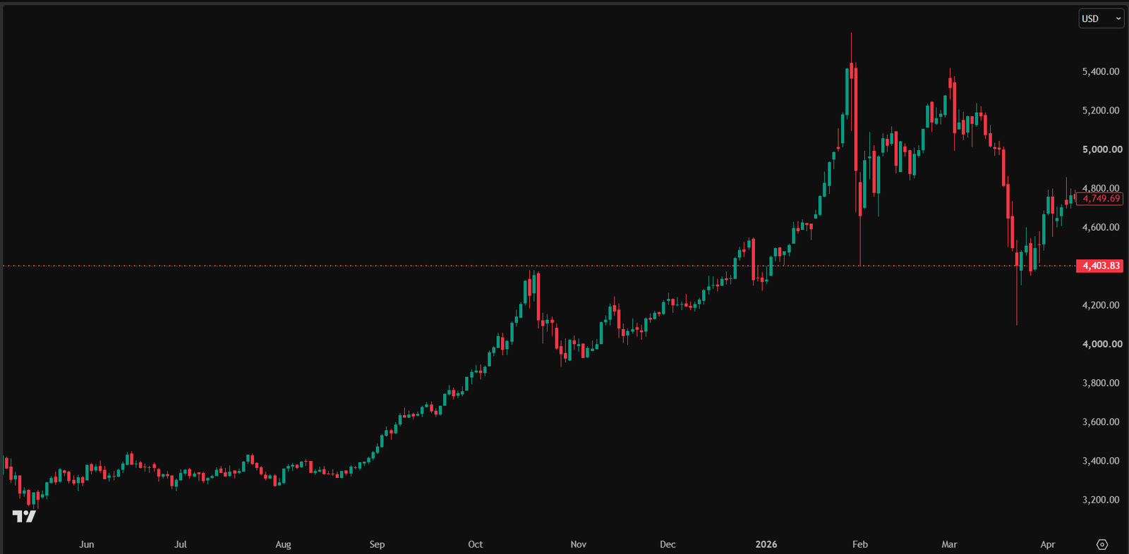
Daily gold chart supplied by POLARIS. The marker identifies the 2 March session. The January peak is earlier and higher: this is a turning point in the renewed advance, not a new all-time high.
Open original chartOn a small screen, swipe across the chart. Open the original for full detail.
Before the shock
Gold was already in an advance. Demand for protection and easier monetary conditions formed part of the backdrop.
Monday · 2 March
The first trading session after the weekend attacks opened with a gap higher. An immediate reaction, not a promise about the next move.
After the opening
The market subsequently moved lower, with rebounds along the way. Oil, rate expectations and positioning offered competing pressures.
Original chart pixels preserved. Date identification: POLARIS. Price levels and session boundaries follow the supplied chart feed; external reports may use a different benchmark.
Before Monday: gold was not starting from zero
Look at the daily chart before focusing on the highlighted session. Gold had already travelled a long way upward. Expectations of tension and demand for protection offered a plausible backdrop; easier monetary conditions also helped the case for a metal that pays no interest. The Federal Reserve had cut its policy range to 3.50–3.75% in December 2025. [3]
There was evidence of demand before the outbreak: gold ETFs attracted US$5.3bn in February, their ninth consecutive month of inflows. [2] That supports the observation that money was already entering gold. It does not establish that most global capital moved there, or that every buyer was anticipating war.
Oil had not yet experienced the disruption that followed. That matters because a market can price geopolitical anxiety into gold before the full energy-cost consequences become visible. The two prices need not move together or respond at the same speed.
2 March: a powerful opening, not a guarantee
The US–Israeli attacks began on Saturday, 28 February. Monday, 2 March was the first trading day of the new week, and gold gapped higher at the opening. The World Gold Council’s report that day records the same direction of reaction. [1] The event date and the market-session date therefore describe two different moments in the same episode.
The opening made sense as an immediate response to danger. But a gap only shows where trading resumed relative to the previous session. It cannot tell us whether new buyers will keep absorbing supply at the higher price. In the wider chart, January’s peak is also above the March opening: calling this candle the global all-time top would misread the picture.
Then move closer: the opening jump did not hold.
XAUUSD / 1 HOUR · H1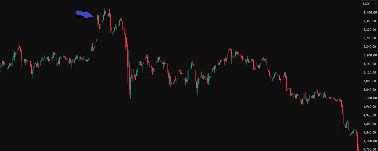
The one-hour close-up makes the 2 March opening jump and subsequent selling easier to follow. Its original blue arrow is retained and the date label sits beside it.
Open original chartOn a small screen, swipe across the chart. Open the original for full detail.
Why could war eventually weigh on gold?
Our interpretation starts with oil. A disruption that raises energy prices can intensify inflation pressure. If investors then expect interest rates to stay high for longer, holding gold faces a competing cost: cash and bonds may remain attractive. The same conflict can therefore support safe-haven demand while also strengthening forces working against gold.
Expectations and actual decisions must be kept separate. On 18 March, the Fed held its target range at 3.50–3.75%; it did not announce a rate increase. [4] Markets can nevertheless reprice the prospect of future cuts before a central bank changes its policy.
Positioning is the other part of the story. Investors who bought weeks earlier may take profits. Others may need cash to meet losses or margin demands elsewhere and sell an asset they can readily trade. A candle records the resulting transactions, not each seller’s motivation. Profit-taking is a plausible interpretation; it cannot be proved from the image alone.
Read the reversal without rewriting every candle
The subsequent path is downward overall, but it includes rebounds and higher closes between selling waves. The close-up helps make that distinction visible. A turning point describes a change in the broader path; it does not require every following candle to close below the one before it.
The later evidence strengthens the reversal story: gold fell about 12% in March, and the World Gold Council highlighted deleveraging and liquidity pressure. [5] This adds an important layer to the oil-and-rates explanation rather than reducing a complex move to one cause.
What we take from this at POLARIS
For us, the useful question is not simply whether a headline sounds bullish for gold. We ask what happened before it, whether the first jump attracts sustained buying, and which other markets change the interpretation. An existing gain can become a source of selling when investors need liquidity.
That is why this series places the original chart beside a dated explanation and identifiable sources. We can revisit the interpretation as evidence improves while keeping the event itself fixed. The aim is a clearer way to read market behaviour — including the moments when a convincing story and the price begin to disagree.
Sources & evidence
- World Gold Council — Weekly Markets Monitor: Crisis hedge
- World Gold Council — Gold ETF flows: February 2026
- Federal Reserve — FOMC statement
- Federal Reserve — FOMC statement
- World Gold Council — Gold Market Commentary: Anatomy of a fall
An educational reading of a past episode, not a contemporaneous trade call or a forecast of the next conflict.